I accelerated product development timelines and delivered significant growth in key business metrics by leading a wide ranging experience improvement program.

Increased conversions

Increased ad performance

Increased search efficiency

Increased marketplace health
Search
Design Strategy
Roadmap Planning
Resourcing
Quality Standards
Product Design
UX Research
Content Design
Accessibility
Design System
Experience Vision
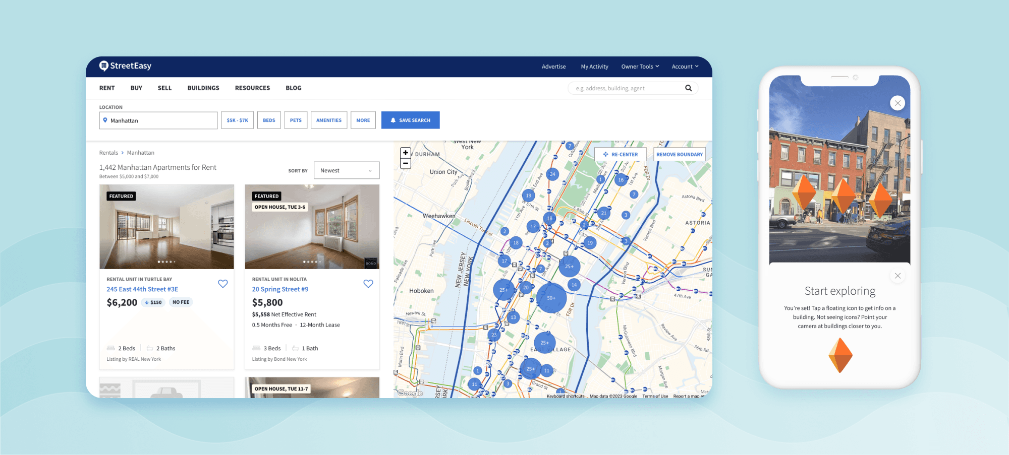
Augmented Reality
Since it's early days as an industry-focused real estate data aggregator, StreetEasy had evolved into the leading real estate marketplace in New York City. Over time, standards for a high quality search experience evolved, creating several opportunities improve performance and experience quality within the core search funnel.
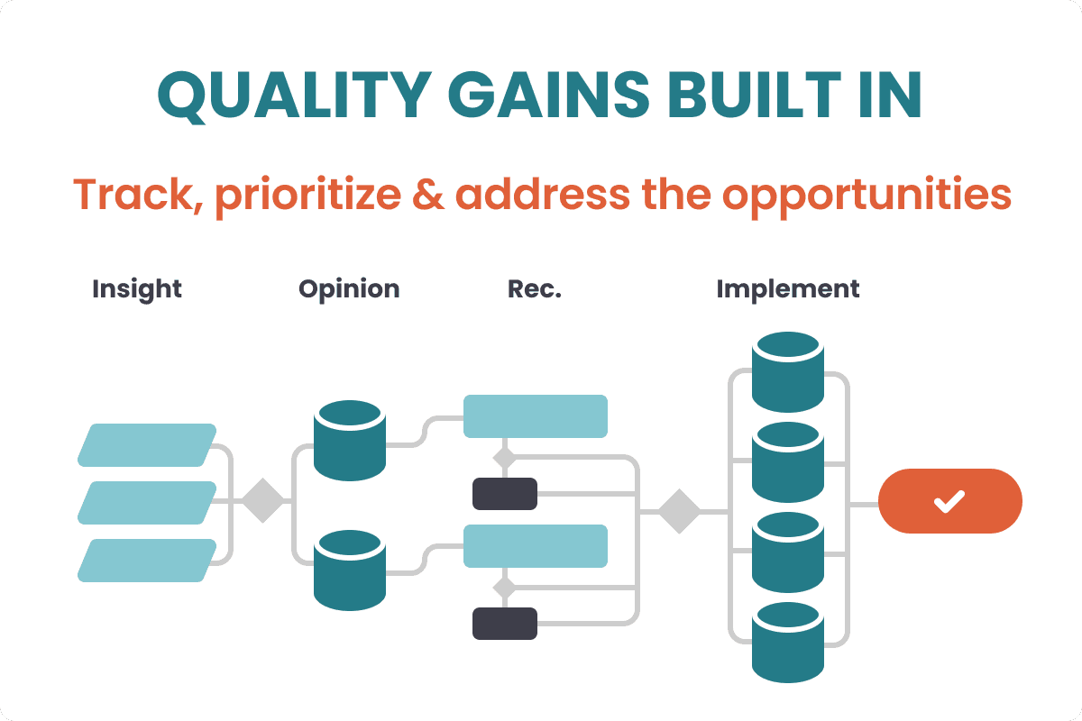
I addressed these opportunities in 3 steps, setting up the platform for long-term success while delivering short term business wins along the way:
1
Close Foundational Gaps
Define Quality Standards
Build a Design System
Meet WCAG 2.1 AA Standards
2
ID and Rank Quality Issues
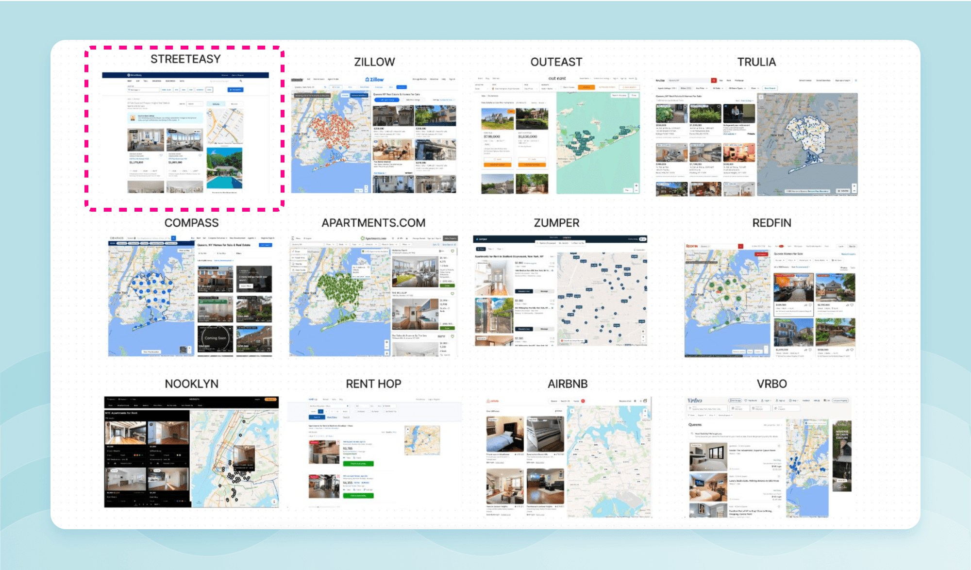
Benchmark Competitors
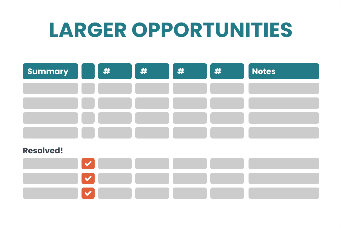
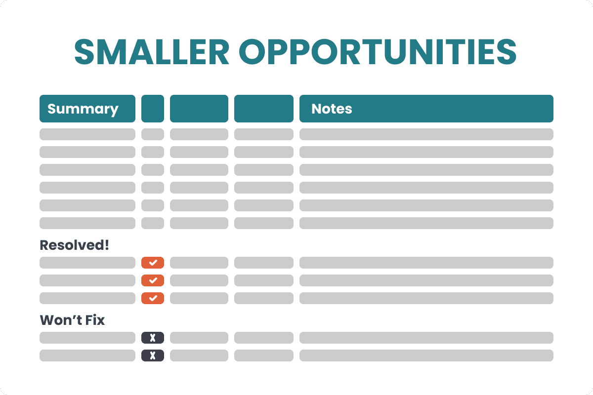
Create a Repo for Issues
Prioritize Quality Issues
3
Fix Priority Features & Flows
Secure the Investment
Large Fixes: Map Search
Small Fixes: Carousels
Closing Foundational Gaps
Design Principles: a Shared Understanding of “Quality”
I led workshops to align my team, partners, and other leaders on a shared definition of design quality tailored to StreetEasy and its users. We established six guiding principles, which I actively promoted in all-hands meetings, one-on-ones, and product discussions, especially during design reviews. These principles became integral to our company's daily language and decision-making, improving collaboration and fostering a holistic approach to design. This also empowered new contributors to engage in design conversations, enhancing the quality and cohesion of our user experiences.
Building a Design System
I led an initiative to create a design system, addressing one of the biggest opportunities I identified early on. Collaborating with the head of engineering and a cross-functional team, we overcame technical obstacles and established a system with clear benefits and goals.
We started fast, setting up the structure and initial components, then focused on sustainability by spreading responsibilities, growing the component library and standardizing the design system practice for sustained succes. Our efforts resulted in:
A repeatable process for component creation and documentation
A North Star vision for a mature design system
A prioritized roadmap and regularly updated roadmap
A communications, adoption and maintenance strategy
Now, our design system, comprising rich set of high-quality components in Figma and React libraries and documented in Storybook, is fully adopted by all development pods and designers. It has streamlined design and development, embedded accessibility at scale, and reduced complexity and costs, facilitating the launch of new experiences.
The Design System exists in Figma and as React components with documentation in Storybook.
Accessibility: WCAG 2.1 AA Compliance
Alongside the Design System initiative, I spearheaded a project to ensure StreetEasy's compliance with ADA web accessibility requirements, making the platform accessible to people with disabilities and fully integrating accessibility into our processes. This involved securing support from leaders at all levels and updating our products to meet WCAG 2.1 AA standards, as well as ensuring all designers and engineers were proficient in and committed to creating a accessible experiences.
I educated the entire StreetEasy team, including senior leaders, on web accessibility's importance and relevance through presentations, one-on-one discussions, and integration with the Design System development. I appointed a designer as our accessibility expert to train the design team on best practices for web and mobile accessibility.
To begin making our site accessible, I identified and prioritized a “golden path” through our core experience for immediate improvement, facilitating swift action. This strategy allowed us to quickly get up everything up to AA standards ahead of schedule with minimal disruption to the user experience and previously scheduled product time lines.
A number of automate checks were put in place to ensure we maintained compliance.
Identifying and Prioritizing Quality Issues
User Testing a Competitive Set
I worked with the UX researcher on my team on a study to compare StreetEasy's home search experience to that of a small competitive set by having users execute and series of core search tasks on each product. The results showed exactly where the experience needed the most attention to remain competitive and served as the foundation for logging and prioritizing the opportunities for improvement.
These insights also created a persuasive argument for investment in the fixing some of the most significant deficiencies. It was clear that many of these fixes would also be opportunities to make gains in meaningful business metrics.
Capturing and Prioritizing Quality Issues
I created two repositories for quality opportunities: one for large items and another for smaller items. I also created a process to rank and find opportunities to address the most important items – usually as part of previously scheduled product work. This process created a consist trend of rising experience quality above and beyond the goals of scheduled project work with little or no extra cost.
Fixing Priority Features and Flows
Big Fix Example: Map Search
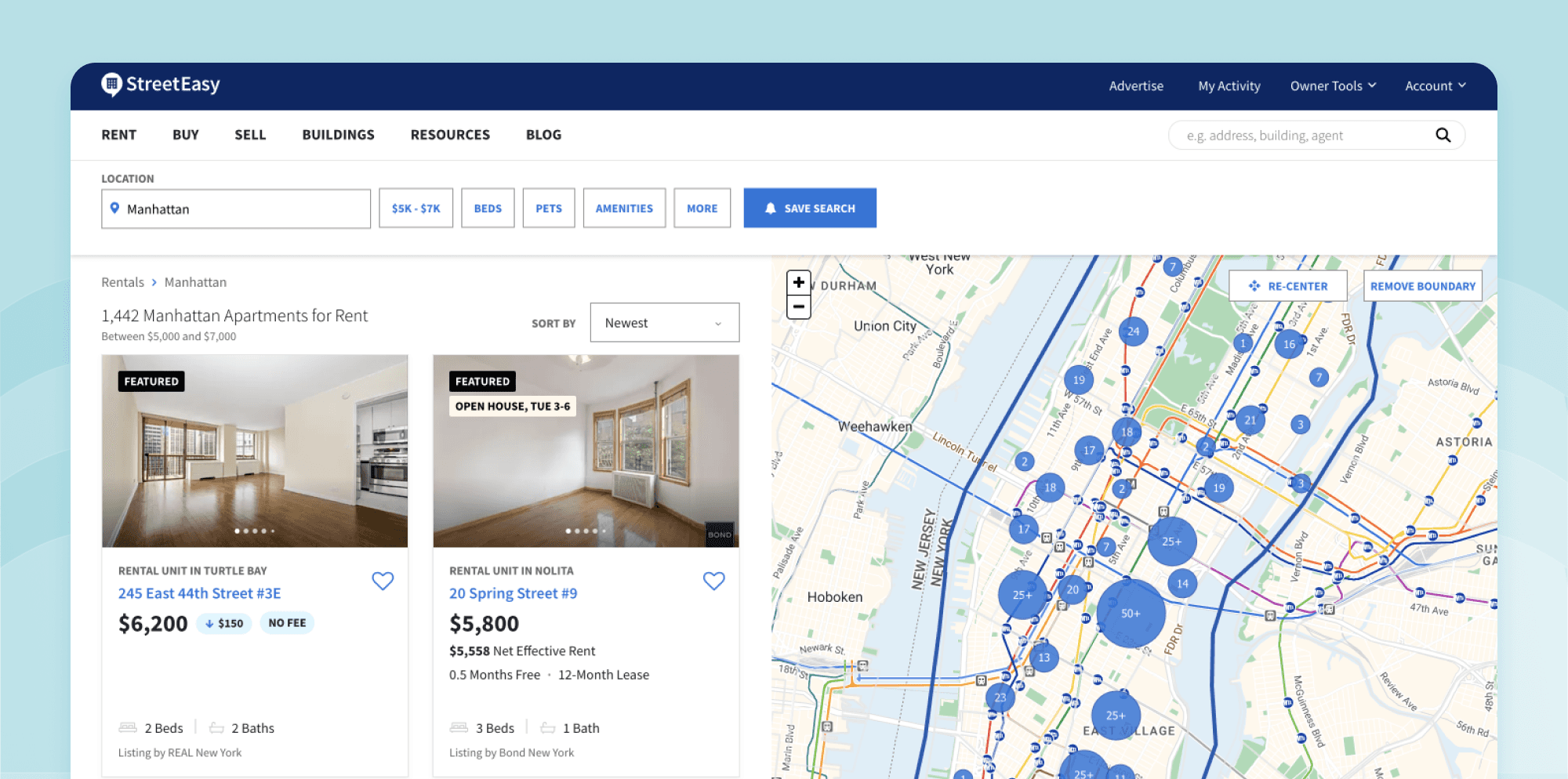
The first major initiative in the search improvement work stream was to create a map-based experience on the search results page. Ultimately, this work resulted in a significant increase in conversions. StreetEasy had a small map, but was far behind competitors in offering visual geo-based search.
Example: A quick look at a competitive set showed that StreetEasy's old "keyhole" map offered less utility than most.
For this larger fix, I was able secure appropriate resourcing and support through the annual planning process. Aside from the obvious need to keep pace with best practices, I was confident that this improvement would increase search efficiency and conversions.
I provided the initial design strategy and ongoing support. I also made sure key stakeholders were informed and aligned throughout the process through weekly reviews with the designer and project team. And I ensured the appropriate UX content and UX research resources were being utilized at the right times.
Some of the more challenging questions included:
How much of the map should be visible at first?
How where should property detail information be viewed? New window? Overlay?
How big and detailed should property preview cards be?
How to best show multiple units at the same address?
What should the low and high end of zoom levels be?
How many listings do we show at a time on the left?
What actions lead to a full refresh of the results set?
What an appropriate density of property marker on the map?
How do you give the appropriate level of visual prominence to featured listings?
Problems solved along the way:

Interaction design complexity required closer design/engineering partnership
Due to the complex nature of the map interactions, I supported the designer in partnering directly with the front end developer to quickly prototype interactions rather than working in Figma, then handing off designs.

The new map had to accommodate sales and rentals marketplaces, solving for competing concerns
I worked closely with the designer and PM to identify and reconcile the differences between two distinct sets of users and two co-existing business models.

It would disrupt an established advertising product
I engaged the advertising business strategist to turn the inevitable disruption to the current ad model into an opportunity to accelerate launch of the more performant next generation ad model. We ended up increasing views on sponsored listings with the new map.

We needed to make the transition to the new map with minimal disruption to the experience
I worked closely with the PM and designer to break the work into pieces that made sense for sequential launch and testing. And I worked with senior leaders to clarify the metrics that mattered so we didn’t fail to recognize success or impede a full launch due to irrelevant metrics.
A modern hybrid approach that allows apartment seekers to combine a visual geo-based approached with the benefits of a list view
Small Fix Example: Image Carousels
An example of one of the smaller, but impactful enhancements was adding image carousels to the search results page on all platforms.
This small change led to a significant increase in our search efficiency metric.
Why hadn’t this industry standard feature been rolled out sooner? It had, but was rolled back due to a decrease in raw home detail page views. That metric was important when the business was focused on a rentals advertising model. The business' focused had long ago shifted to the sales/success fee model, but some of the old metrics were still being tracked. I worked closely with business strategist to make sure we were aligned on which metrics were most relevant.

Improved Quality, Speed and Performance
Though the success of the individual projects is notable, it's the cumulative effect that has unlocked StreetEasy's ability offer experiences with a new level of speed and quality. StreetEasy is now positioned to move rapidly in pursuing today's AND tomorrow's business goals while protecting it's position as NYC's leading real estate market place.


